

Fixing Bank of America
I hate paying off my credit card bill—who doesn’t?
Not only is it a harsh reminder that credit isn’t free money, but navigating Bank of America’s website to pay it off is a nightmare. Finding my balance is like searching for a needle in a haystack.
Sometimes I wonder if banks design their online banking UIs to be confusing on purpose. It might explain why consumer credit debt has hit an all-time high; people can’t even figure out how to pay off their balances.
To help us put an end to the consumer debt crisis, we turned to Depth for help. We spent some time on Bank of America's online banking site simulator, and with Depth’s insights, we pinpointed areas for improvement.
Cluttered Home Screen
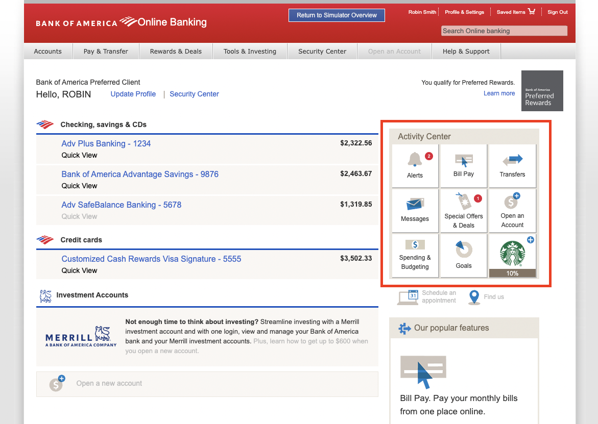 Navigating through the home page and the Activity Center is overwhelming due to the clutter of numerous icons and features.
This design makes it difficult for users to quickly find and utilize the most important functions. Simplifying and reorganizing this section by prioritizing commonly used features would significantly enhance the user experience.
The goal is to make the interface more intuitive and user-friendly, enabling customers to manage their banking activities more efficiently.
Navigating through the home page and the Activity Center is overwhelming due to the clutter of numerous icons and features.
This design makes it difficult for users to quickly find and utilize the most important functions. Simplifying and reorganizing this section by prioritizing commonly used features would significantly enhance the user experience.
The goal is to make the interface more intuitive and user-friendly, enabling customers to manage their banking activities more efficiently.
Finding Important Features is Hard
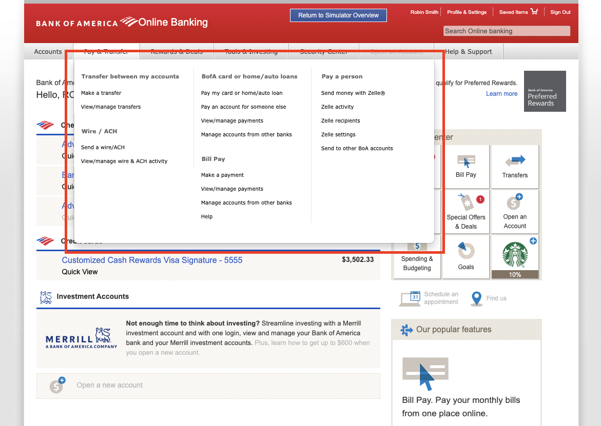 The placement of crucial banking features like Alerts, Bill Pay, and Transfers in a small box significantly hinders their visibility.
This poor design choice reduces the accessibility of essential functionalities, leading to user frustration and underutilization of important banking services.
Enhancing the visibility and accessibility of these features is critical to improving the overall user experience and ensuring customers can efficiently manage their finances online.
The placement of crucial banking features like Alerts, Bill Pay, and Transfers in a small box significantly hinders their visibility.
This poor design choice reduces the accessibility of essential functionalities, leading to user frustration and underutilization of important banking services.
Enhancing the visibility and accessibility of these features is critical to improving the overall user experience and ensuring customers can efficiently manage their finances online.
Lack of Personalized Budgeting
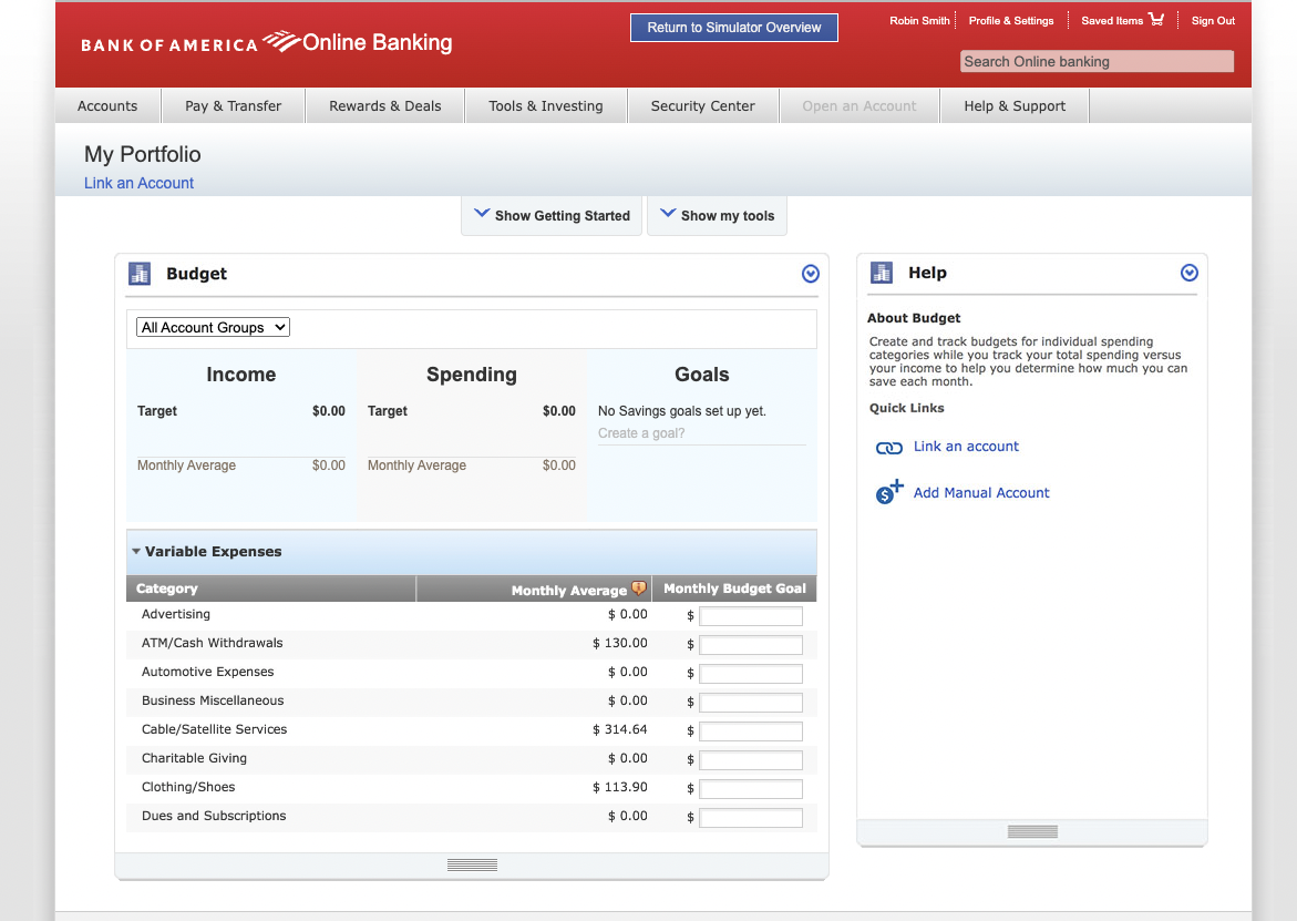 The budgeting feature on Bank of America's online banking platform is difficult to use due to a lack of guidance.
The platform lacks personalized financial insights based on user behavior. To address these issues, a more intuitive design, clearer value propositions, and personalized recommendations are necessary.
These improvements would significantly enhance the overall user experience and utility of the platform.
The budgeting feature on Bank of America's online banking platform is difficult to use due to a lack of guidance.
The platform lacks personalized financial insights based on user behavior. To address these issues, a more intuitive design, clearer value propositions, and personalized recommendations are necessary.
These improvements would significantly enhance the overall user experience and utility of the platform.
Paying off Bills Plagued with Barriers
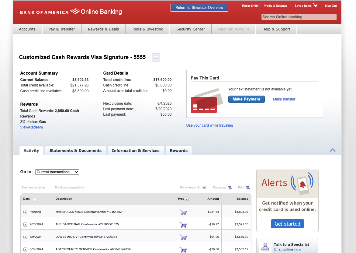
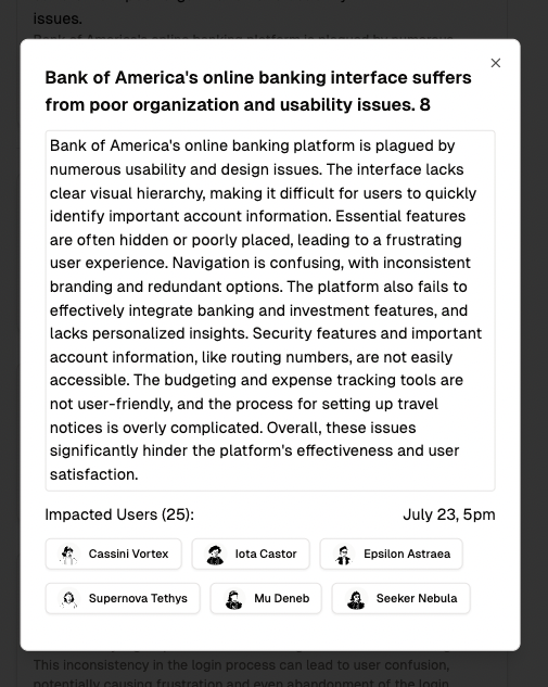
 The organization of the credit card payment flow is plagued by poor usability and design issues. The interface lacks a clear visual hierarchy, making it difficult for users to quickly identify important account information. Key features are often hidden or poorly placed, leading to a frustrating user experience. Improving the organization and layout of these features is essential to making the process of paying off credit card bills more straightforward and user-friendly.
Fixing these usability issues isn't just about better design—it's about helping people manage their finances more effectively. Depth identified these key problems on Bank of America's platform, showing how improved UI can make a big difference. Let's push for better online banking experiences.
If you're interested in having Depth make your product better, let's chat. Here's my calendar link.